So here we go with the half way celebration / party – there are 23 pages in the issue of Daredevil I am working on, but as that doesn’t divide into 2 I figured let’s make one more page to even it up to 24 and use that extra page to go experimental
But what to do and where to start?
If you was with me a few weeks ago, I decided to try and step out of the Daredevil project and do something a little different – taking something done from the project as a starting place and see where I could go with it
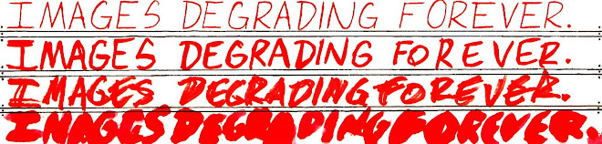
I figured the last panel from page 10 fitted the bill very well indeed, the massive huge big letters saying “Matt, Is something wrong?”

I had already made the connection in mind with this and Matt Seneca’s rather infamous smoking of the Punisher 1 over on his magnificent Death to the Universe blog as where I could take the statement “is something wrong”
So I figured the experiment would be to see if “art” (and I use that word rather loosely as its combination of styles and techniques (“Found art” with actual line drawing for example) which are not normally combined together ) could be made from a blog – specifically Matts blog entry – where indeed something was wrong!
So with permission from a very generous Matt, I took photos and text from the blog entry and combined them together into a comic book like layout.
The size and width of the “is something wrong” dictating that the piece had to be landscape.
The choice of replacing Matt Murdock’s face / head with Matt Seneca’s also being obvious
Next the space left dictated there could only be 3 photos (or panels) to tell Matts comic smoking experience to show what was wrong, so I chose the photos I thought suited best, made them grey scale and printed it out
I then put this on the light box; pencil traced this and inked it as finished as I could make it

I scanned this drawing in
Then I put in a paint explosion background, dropped the text from the blog on top of that, the finished drawing on top of that and then alpha out (made invisible) a lot of the white from the drawing so the background would come through
But, look for yourself – this short video shows you each step to the finished piece (click to play)
Which looks like this:-

Unusually for me I am quite happy with this, well at least the drawing of Matt next to the big letters but that was the clearest photo to work from, whereas some of the others was a bit tricky, particularly the last one which was very blurry (and didn’t have a tear)
So the questions are:-
What did you think of this?
What indeed even is it ? (baring in mind that the actual completely finished product only exists as a computer graphic)
But I think it’s safe to say the end result is fairly radical from what has been done to date
Next week, normal service resumes – join me as we find out why is Lavender blue?
No comments:
Post a Comment
Note: only a member of this blog may post a comment.