Thursday 30 September 2010

Size Matters?!

You may remember I declared I was probably working smaller than Steranko did originally - but how small is the question... which Matt Seneca dropped into ask - as well as letting us know how big Steranko did work...

Matt Seneca said... Lookin' hot! What size ARE you working at? I believe Steranko worked at least double print size mot of the time (which woulda been 11x17 on Outland).


Robin said... Hey Matt I am using A4 paper size which is 8.3 x 11.7 inches - thats 2.7 inches less tall and 5.3 inches less wide !
Yes I am working either at or just slightly smaller than actual print size - on all those tiny details - this explains the time its taking and why the end results will be a bit unusual...


Thanks Matt - sorry it took me a while to answer this!

And thanks for the praise...!

It's about time!


I was going to discuss the clock that serves as a tension builder throughout the last part of the movie - as it makes it's first appearance here:-


But ironically enough - I never had any time to do any line work yesterday and I was short of time today

Must try harder tomorrow

Who said time was a clock of the heart?!

Anyways - the use of the clock in Outland is a nice modern twist on the old clock tower in the town chiming high noon - but here the clock is digital and literally rattles off every second and is faded in and out relentlessly rattling along building up tension as the shuttle of doom arrives….

I wonder if the TV Show 24 took inspiration for its use of digital clocks from Outland? 


What do you think?

Tuesday 28 September 2010

Just the little things

Well okay - not Just - the little things in Steranko's art are piled a mountain high

Take the line work I managed to do so far:-


Now see if can find the door behind the two tiny seated anonymous crew members I managed to line -

The door is done in negative form to show the shadow at the end of the corridor - that might not sound that unusual until you figure out quite how small this is - those crew members have even tinier detail - I can only guess how large Steranko worked on these panels originally but they must have been fairly big for all that detail to come through reproduction and there is literally thousands of tiny details in each page - this is one of the things that attracted me to the original art - as its such a tour-de-force in a number of ways - a combination of massive looming figures, whited out shadows and incredibly tiny figures all in the same panel!

The thought and planning that went into how to combine all these elements and maintain a fluidity of storytelling is beyond inspirational its almost refining the art of comic story telling as its known

Jim - I take my hat off to you on this!

Tomorrow, luck and a bit of work willing - we might just discuss time...

Monday 27 September 2010

He watched his flock (in perpetual) night..

Onto Page 5 now - which originally looked like this:-


And my "pencils" of the same:-


In which we are introduced to Station Manager Sheppard - and Montone....

I wonder how deliberate each character's names are on the part of Peter Hyams?

I mean after all - almost anyone else in the story acts just like a sheep following orders blindly with Sheppard leading the flock and the one character who you think might just have a few shades of grey to start off with - but turns out at the end to show his real colours (as being black and white) is Montone!

Speaking of black and white  - this might look a bit better with some ink on top of it - mind you that's not a promise!

Sunday 26 September 2010

Here's page 4 - But where's page one?

As I am short on time next week - I have got ahead and page 4 is finished :-


I heard from Tony Robertson - from the excellent The Drawings of Steranko site:-


Who asked :- "I was wondering why you did not start with page 1 of Outland?"

Good question!

The reason I did not do page one is that I am adding a photo of Jupiter into any finished page that needs it -like I did with the first completed double spread - as I am not going to pretend I can paint - and if its all of the page rather just little bit I might as well put at photo of a lot of stars in the background rather than use my bad method for doing stars - all that leaves is a couple of boxes for the story text to go in, a outline showing the page edge , a circle for where the Jupiter photo should go and the Outland logo.

All I physically need to draw is the Outland logo on its own surrounded by a bit of black - which I will probably do later - I will probably leave this to last and see how far I get in my efforts - and save it as a treat for completing the project - after all I am going to have to at least get lettering done to make it a completed product!

And yes the Lettering will be done most likely by computer - unless someone wants to download a finished page and add lettering? This is a open project - anyone can grab a page of pencils, ink them, add lettering colouring etc - it would be great if anyone wanted to join in!

Saturday 25 September 2010

Sha Ka Ree!

Yes folks - it's the first appearance of "the hero" in Outland - Federal Marshall William T. O' Neil as portrayed by none other than Sean Connery..


So what is Sha Ka Ree then? Star Trek fans will know almost right away it's the name given to the place  that was featured at the end of Star Trek V : The Final Frontier - the equivalent of Eden

And was so named as the role of Sybok was originally intended for --- you guessed it - Oh well if Sean did not make it into the movie, at least he had Eden named after him - I wonder are there any golf courses there?!

Friday 24 September 2010

It's not all black and white

Oh the Art so far definitely is!

No I mean the processes I sometime use

Case in point - as I knew I did not have a lot of time today - I purposely chose to do the easiest thing and just do as much blacking in as I could - no tiny little bits here - just gallons of ink - and on this page - as there is a quite a large area of just black - the illusion is I have made quite a bit of progress:-


Of course most of the rest of the drawing will not be that easy! 

Thursday 23 September 2010

Page 4 Penciled

If you are already familiar with Steranko's Outland - which is what I am trying to reproduce here you will already know there is quite a number of double page spreads!

If not - or you just wanted to see the original in all it's magnificence - just pop over here:-

Jim Steranko's Outland!

And why not say Hi to the guys over there!

Back with me - I am onto the next double page spread - the first page of which looks something like this originally:-


And these are my pencils of the above:-


There's a lot of blacking in to do!

Wednesday 22 September 2010

Two Pages done!

Hi - Well I have completed page 2:-


And as promised - here are the pages together - with a photo of jupiter in the background :-


Not too bad for someone with no talent!

Tuesday 21 September 2010

The Panels finished

After a few more hours at the drawing table - the first panel is finally finished:-


Some of the framework looks a bit wobbly! Is the part where I mention I am working at less than 1:1 ratio, that is to say the piece I am working from is actually smaller than it was printed - let alone drawn

Well you can't say I do not like a challenge!

Hopefully I might just get those 4 smaller panels done - if so I will join the 2 pages together as Steranko intended and see what it looks like

Monday 20 September 2010

Inking progress?

If you have been following me so far, you will have seen it took longer than 1 day to just roughy pencil page 2 - so it should be no surprise the line-work is taking longer...

You will probably need to look closely to see what I managed to line today -


 all the lines are so tiny and precise it's taking some time - I can only hope the end result is any good!

Sunday 19 September 2010

And he inked on a Sunday

A few hours inking on Sunday is a great way to relax...


Still a long way to go!

Thursday 16 September 2010

Page 2 Pencils done

As I said when i looked at the original there is so much really fine detail on this page it is going to be tricky to do it justice...

Here are the finished pencils for page 2:-

Inking this I think - is going to take some doing! Fingers crossed (well not while I'm holding a pen)

Wednesday 15 September 2010

Pencils so far

Well believe it or not the below represents about 1 hour and 30 minutes of work:-

Still a long way to go before it even vaguely resembles this:-


Best get working harder tomorrow!

Matt Senca "Versus" Glamourpuss

Hey! Remember I said I thought I may have been incredibly lucky a couple of posts back?


Well It turns out I have heard from the ever incredible Matt Senca - who as I am sure most of you visiting this blog right now will know writes his fantastic blog Death to the Universe!


Death to the universe!


And by fantastic I mean it's delightful and incredibly informative and fun to read, Matt obviously not only totally loves comics, but has a incredible knowledge of comic art in all it's forms - whenever he writes about material it's hard to not get inspired!


Matt has wrote the following words on the Outland-ish experiment :-


"Robin Barnard is off in his own universe, sailing beautifully part Jupiter, and you oughta watch for the next while because it's getting better all the time."


Thanks so much Matt!


Yes Matt is also generous with his time and is happy to give people a hand - that makes him one in a million in my book


And Hello to anyone visiting here - I am more to happy to answer any questions anyone has!


But what is this about Glamourpuss - you may ask?!


Well in counter-point to Matt's missive -


Yours truly is mentioned once again in Glamourpuss issue 15 out now and this is what Glamourpuss had to say when describing my methods (mind you she has not seen what I am doing now and is not my agent for what I am doing now either):-


"Try not caring so much. Allow your pen to wander where it will with no conscious direction from yourself, just as if you were a two-year-old with no grasp of corruptions like form, design, technique or style.  Before you know it, glamourpuss might agree to be your agent!"


For those not keeping track (probably everyone) Glamourpuss (as my agent) has offered 3 of my other pieces of work for sale:-


Just goes to show you!


Has that cow been milked already - you may ask? 


Well I do have quite a number of "Glamour-gals" similar to the above littering the table I draw on - hmmm should I send these on?! Or has that horse been beaten enough already?


Let me know!


Oh yeah - best get on with penciling that next page - sorry got distracted then!


R

Tuesday 14 September 2010

First Page done!

After 3 days of solid inking here is the first page completed:-


Those small panels took a lot longer than I figured and make me wonder how hard is the next page going to be...

This is what the scan of the next page looks like:-


A lot of very tiny and delicate detail there even in the big 3/4 of a page  panel - it's so easy to black in a tiny white line that's supposed to be there in the final unless you constantly reference the original!

That and one other little rule I am trying to remember to be filed under The Methods - always outline the outside of a shape that is going to remain white inside - and (you guessed it) always outline the inside of a shape that's going to be black

Sounds simple and possibly even condescending but I keep having to remind myself this, particularly on those tiny panels where one line out of place is - no good!

Monday 13 September 2010

Day 2 Of Inking

Well I have managed to finish the first panel! Just that is giving me more of an idea of what an undertaking this will be...

This is how far I got by the end of yesterday


Those small panels at the bottom are going to be very tricky - it's a lot easier to do something big with a lot of detail than something small where you have to really look to figure out what is supposed to be there!

The Methods
In what will probably be a series of mini features - I will cover a method I use for doing something particular - just to give you an idea!  This time - have a look at the stars in the above - now as far as I know most artists black in everything and then use a white out pen or white paint to put in stars afterwards - not me as I am not that good with the whiteout pen - so I line the outside of the stars around 1 and half times bigger than they should be and then black around the rest - actually that's probably more difficult - well it certainly accounts for why they are "appealingly all over the place"!

Speaking of which - I think I may have just got incredibly lucky - Keep you eyes out for the next few updates

Friday 10 September 2010

Hey there,

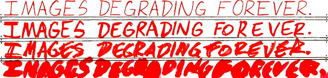
Well it's been a quiet few months on the Images Degrading Forever front - and its my fault for getting so distracted - Of course the experiment is still very much open to all, so grab hold of the images and have a go yourself!

I have been thinking - well in the meantime what can I do to keep this blog full of new material and stay within the idea of taking images and degrading them?

Simple enough just do some more "re-interpretations" of art myself! But what?

That was a question for a while and I had a backlog of other stuff to do - but that's finally cleared my table - and at the moment inspiration came - once again from Matt Senca's utterly insightfully and enjoyable Death to the Universe blog:-

Death to the Universe!

For some reason or another I have a compulsion to do something (in my eyes) thats just completely left field to push myself to ridiculous extremes (given my actual ability) by attempting to rework the more outlandish examples of comic material thats out there

I have the notion that this is the way to learn how to draw better myself, which I am still very much working on

So what are we talking about, could this be a literal train wreck ? Quite possibly

As the idea that has lodged in my mind is that finally I wanted to rework a entire comic, not just one (or even several images) from one. In short I feel I have to learn about layout pacing and things like that of which I will cheerfully accept I know little about!

Perhaps this explains the choice of material, but I am more inclined to think I had to pick something that provided enough inspiration and excitement for me to have a chance of completing the project

Yes that's right - at the moment I do not know if I can or even will actually complete this, so this could end up being a train wreck on several levels

But I know from experience that I tend to produce material regularly if I think someone is actually looking at it, so putting it here seemed to make sense

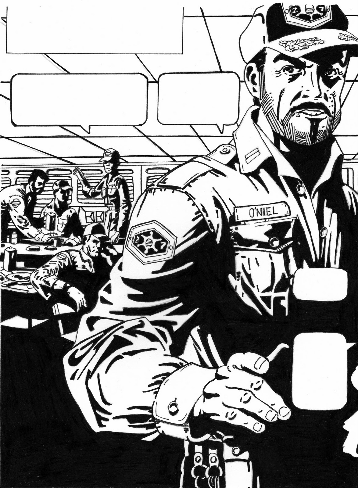
Anyways - look this is it - I am going to attempt to rework Steranko's outland

Yep - you read that right - Streanko's outland

The thing that has already grabbed me about this already is that it is reminding me of Frank Millers Sin City when it first came out as it has that same literally locked contrast approach to black and white!

I am already joking to myself that what I am attempting should be sponsored by the company that provides ink as I am using so much!

Anyways enough hyperbole

You can join in with this mad outlandish project if you like

Here is a scan of the first page I am working on now:-
Here is my pencils of the same (for anyone else to have a go at "degrading'):-

And here is how far I have got so far with spilling ink after 1 day:-


As you can guess this project may well take me quite some time - so lets say that conservatively I might actually get done in about 40 some weeks, 1 page a week basically

I would love to hear what anyone thinks about this - but no I have not quite cut my ear off yet - despite what Glamourpuss 12 said!

Oh and of course my sincere and most heartfelt apologies to Jaunty Jim !